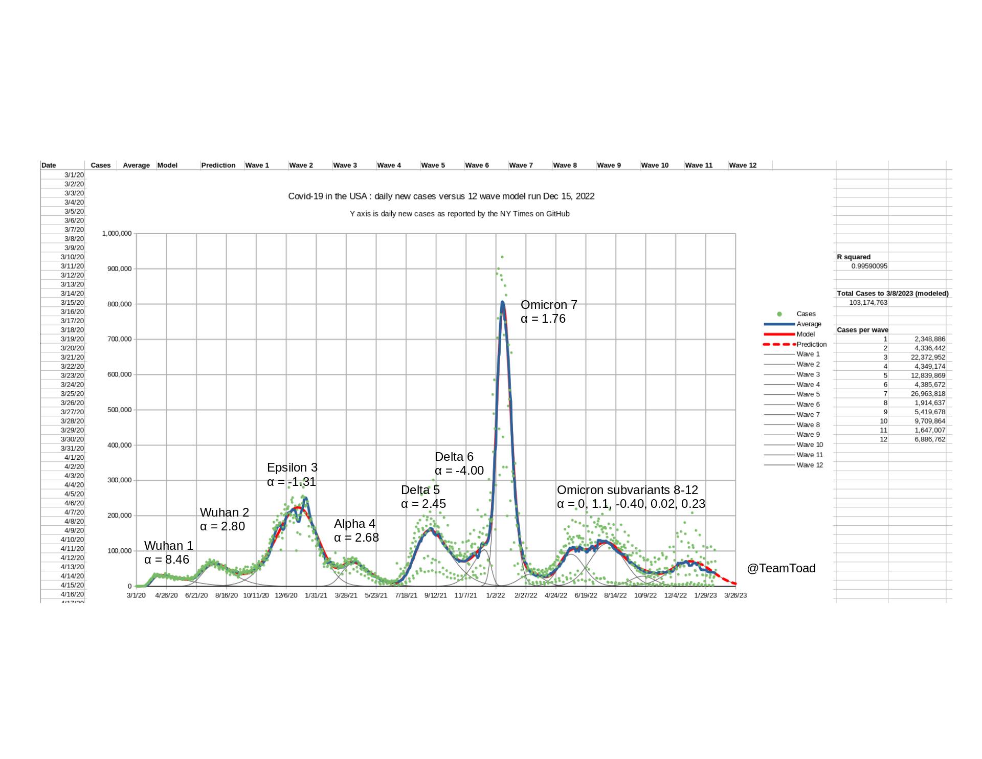
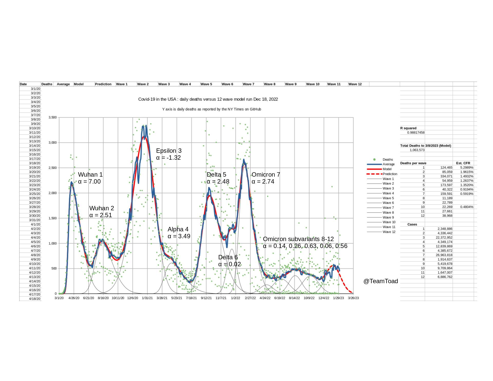
These are the main two charts showing the number of new cases and deaths in the US.
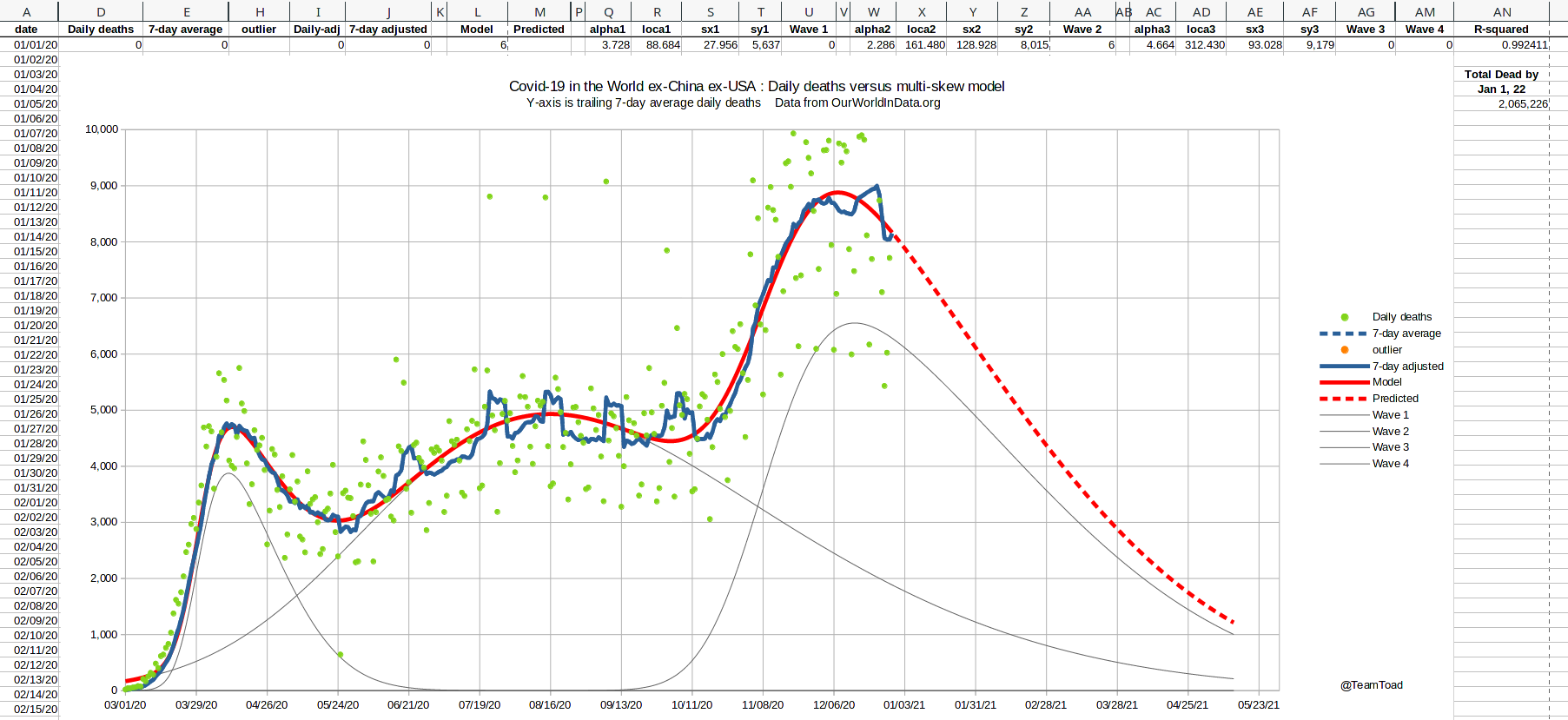
Cases and deaths are each modeled as the sum of twelve (12) individual waves,
each specified by four parameters as described in
the Theory Page.
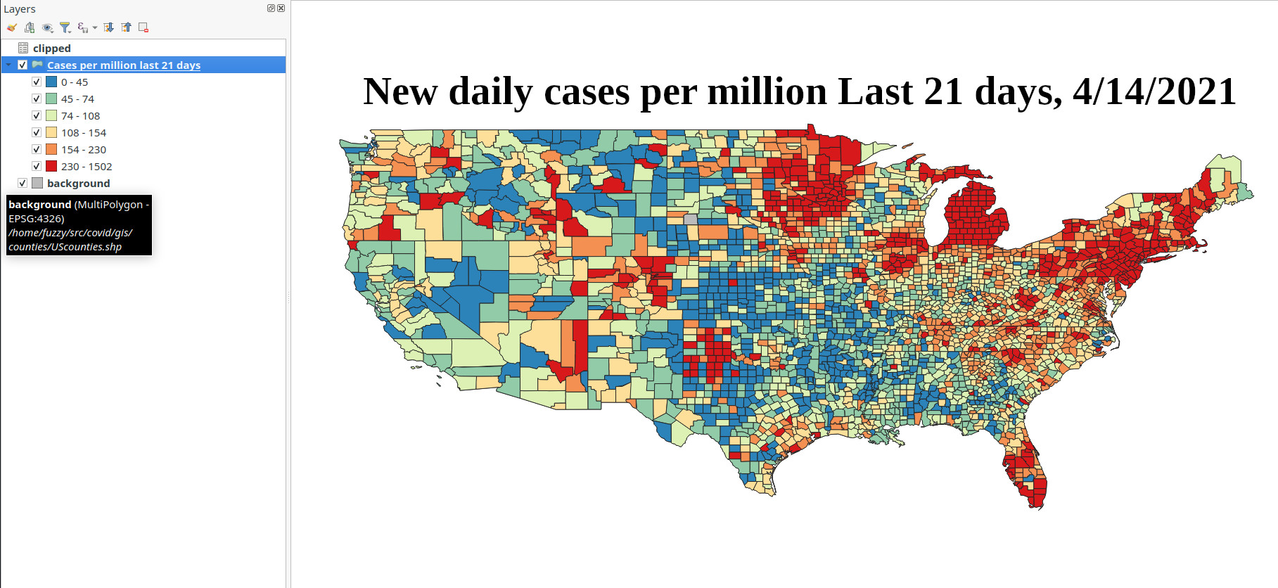
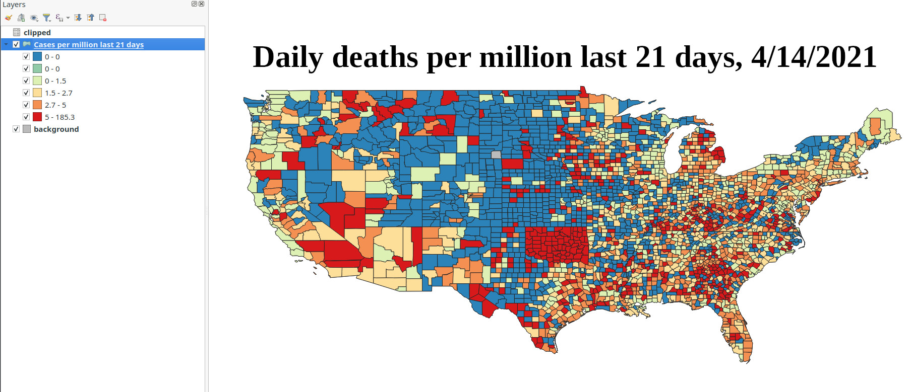
Last 21 days of cases and deaths as of April 14, 2021
These heat maps shows where the most new cases and were confirmed in the last 21 days on a county
by county basis. This chart is normalized by population. Note that Oklahoma restated their
numbers on April 7 adding 1,800 cases from previous months, making them appear to be much worse for
recent deaths on this map.
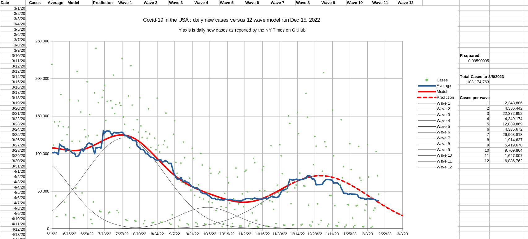
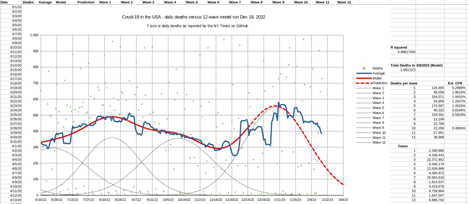
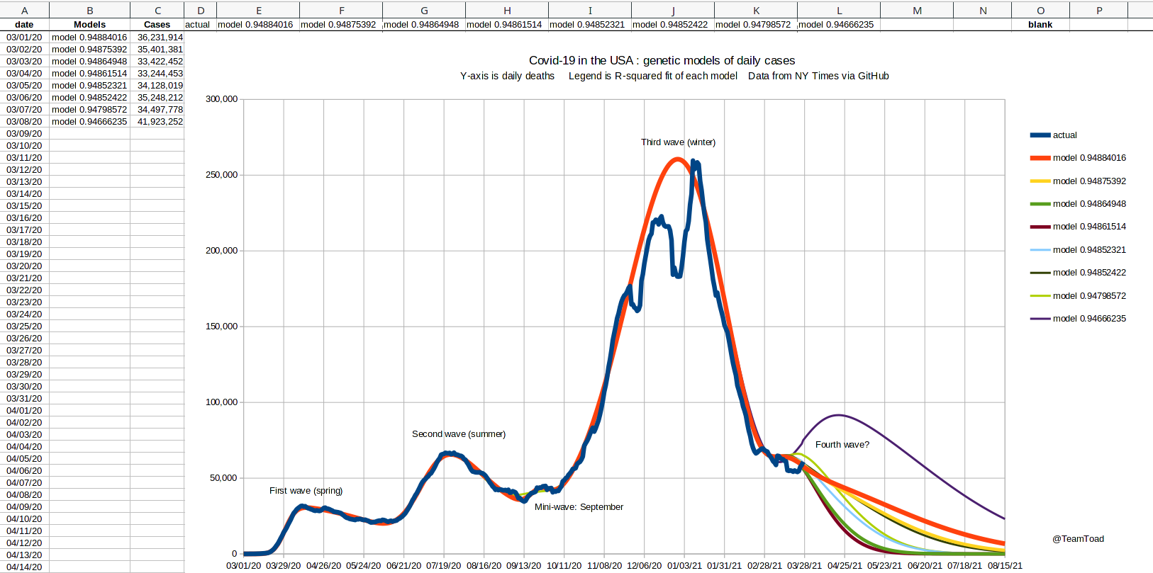
It's clear that the cases numbers have started a new trend, so I ran a new series of
genetic searches to the case data through March 26, 2021. The plot on the left superimposes
all eight model runs together, and you can see that there is no real agreement from
run to run.
This is typical when modeling the upside of a skew-normal curve, as there is rarely enough
date to predict the "peak".
The thick red line is the run with the best R-square measure.
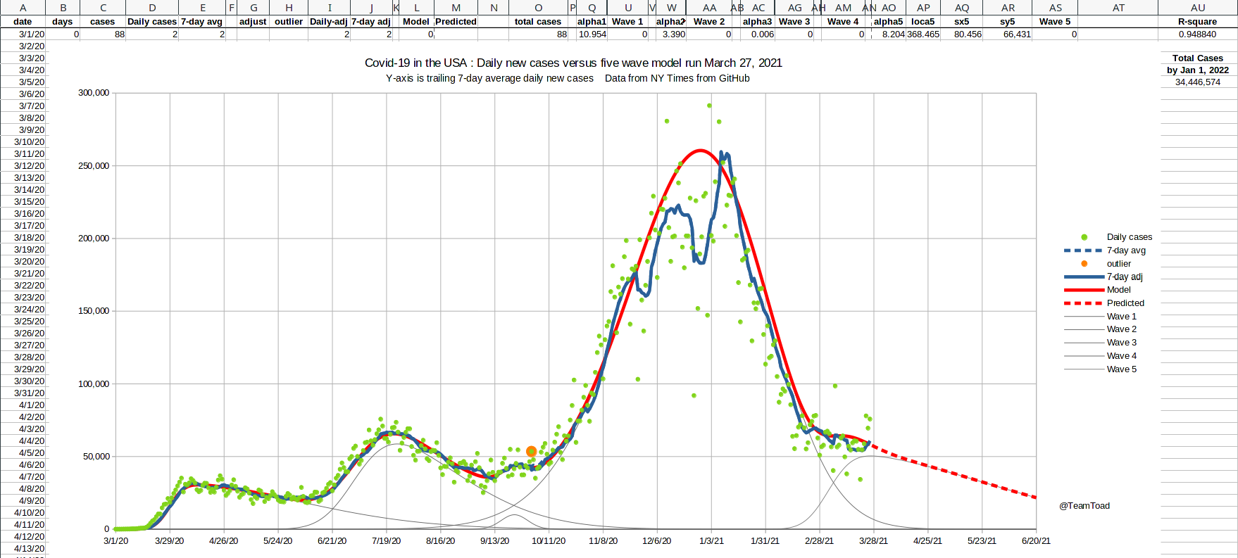
The chart on the right shows the actual trailing 7-day average, the sum of the five waves,
and the individual waves for the best fitting of the eight genetic searches.
The press will likely call this the "Fourth wave", and we can see that
the magnitude of this wave is already as large as the second wave last summer.
We do not yet see a corrsponding bump in daily deaths. It is possible that either
a younger demographic or the vaccination of over two-thirds of the elederly population
will prevent this case-bump from increases the numbers of deaths. Time will tell.
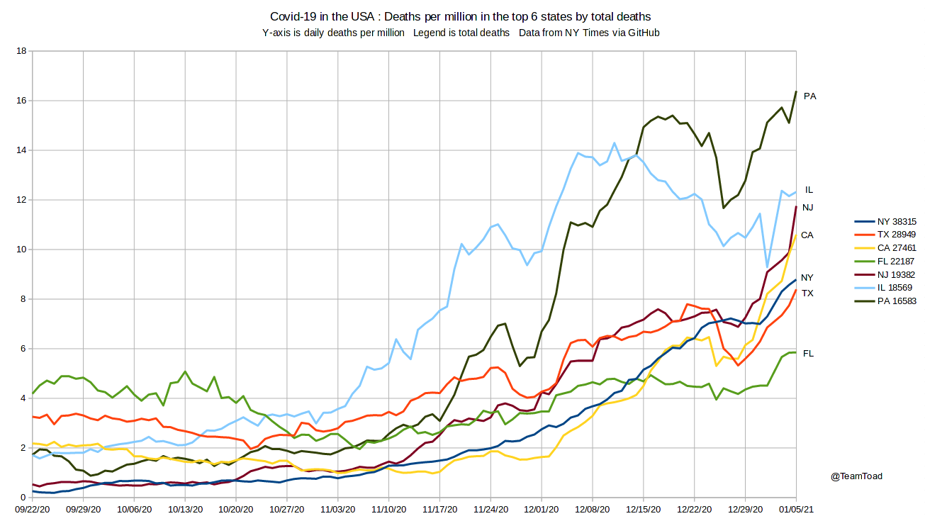
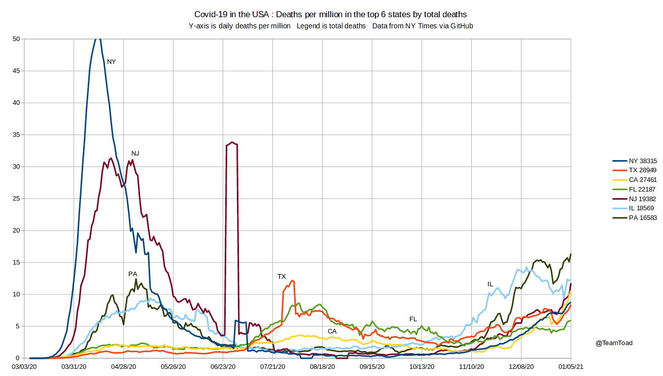
Daily deaths per million, top six (6) US states, January 5, 2021
Choosing the six (6) states with the most deaths total, these charts show
the daily deaths per million in each state. The left chart is a detail showing
deaths from September 2020 through January 5, 2021. The right chart is the same
data for the whole year.
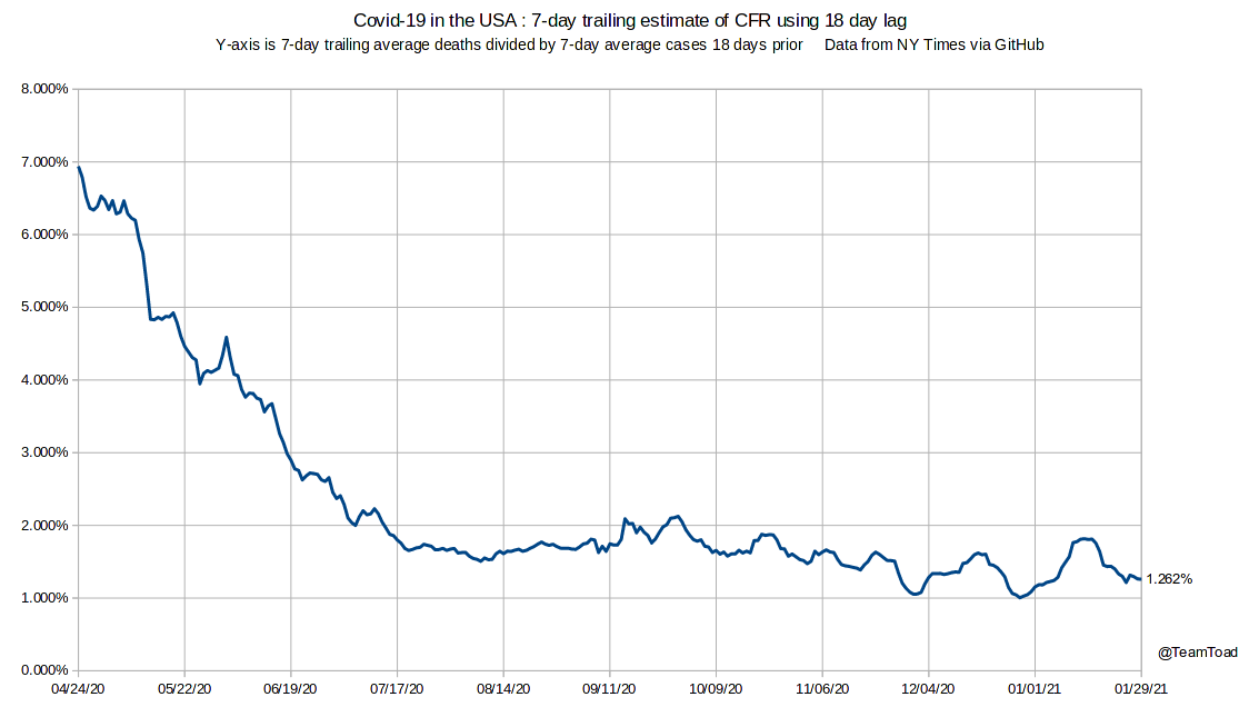
This chart estimates the Case Fatality Rate (CFR) by dividing the 21 day trailing average of
daily deaths by the trailing average of the number of new confirmed cases with a lag of 18 days.
The number for January 29, 2021 is 1.262%, meaning that for every 79 cases on December 19th
average there was one death on January 6th, 2021.
The 18 day lag is based on examining the case and death charts, and has varied from 8 days in
April to 20.5 days in August.